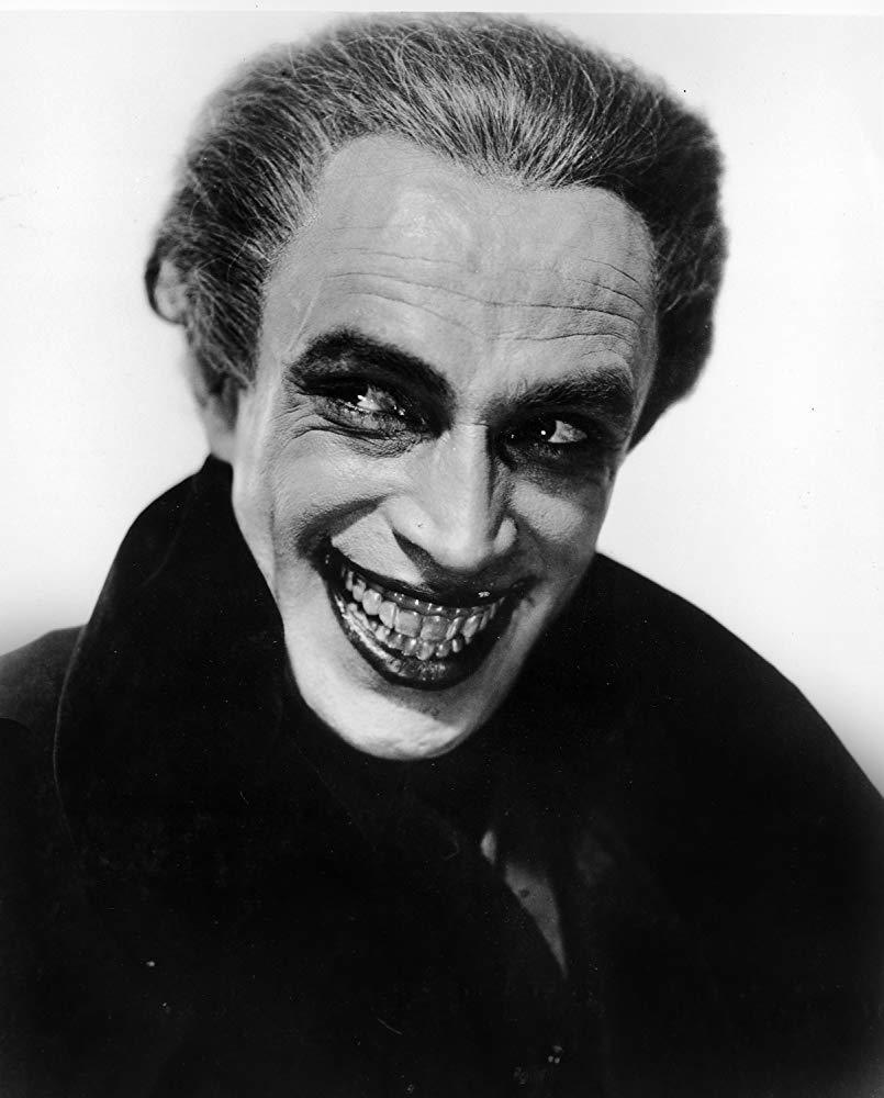
I hate bright mode pages


Quitting Elden Ring at 1am.
Hahahhahaha this just happened to me last night and it legit kept me awake for another 30 fucking minutes….
BANDAI NAMCO
- the last text ever read before my optic nerves spontaneously combusted.
pov: me starting ace combat 7 at 3 am
The dark reader extension has really helped my neighbours not noticing that I am still using my computer even at night
Flashbang!
In the beginning …
deleted by creator
I’m one of those genetically malfunctioned ones that prefer lightmode.
It’s just more readable.
I find the bright light makes it hard to read at night. To each there own, I just wish my screen would auto dim when I open a bright photo/meme.
I’m the same it’s just I don’t often use any devices late into the night. If anyone knows how to have KDE switch between 2 themes depending on time then please let me, or us, know.
I prefer light or dark depending on the time of day. I must not be alone, because Android has had that option built in for years.
Especially when you have a light source other than the screen. Which everybody should.
I even have that problem with Lemmy when I scroll to a bright image.
Hate how extensions dont work on firefox related websites and they always explode on my face
These pipes… are clean!
And how.
and i hate using dark mode tools because they’re usually buggy [buttons look weird, rendering time, sometimes stuff is hidden]
yellow lense glasses are my favorite browsing tool
Wikipedia
Joke aside, looks like your screen brightness is too high to begin with. If it’s set correctly, a light mode tab in an otherwise dark UI should be a mild disruption, not something that blinds you.
Legitimate suggestion: get into the habit of controlling the screen brightness and your eyes will thank you. There are DDC utils that let you control the hardware brightness (and other parameters too) of the monitor via software. I for example like ClickMonitorDDC (works well even if it’s practically abandonware), you can do things like scheduling based on time of day and controlling multiple monitors simultaneously.
I’m over 70 years old and I know exactly what hurt my eyes. White background with dark letters are fine in a book, but white in a screen is because it is a light with all pixels on. There are no much contrast with dark letters apart it dazzled my eyes. White letters on a dark background are much more confortable and readable for me, yes or yes.
Fair enough. I’m not saying “don’t use dark mode”, I’m saying don’t rely solely on it. Dark mode with brightness cranked up to 100% might be worse than light mode at 20% brightness if that’s appropriate for the ambient light you’re in.
I agree about contrast; to me white text on black background is about equally as bad as black text on white background (but fortunately most dark themes are not white on black). I look at text all day long and usually prefer something with a medium gray-ish background and light letters; in very rare cases I’d resort to a light theme just for its contrast (e.g. working on a laptop outside during the day and I can’t bring the brightness any higher).
For my old eyes a 20% Brighness is even worse for me to read the content without putting my nose direct on the screen. But yes, dependig on the contrast settings, also white letters on black background can be dazzling, but no t so in a normal contrast, at least for me.
I wish it were better integrated into GNOME / KDE so I could simply use the brightness controls on my keyboard.
I set my brightness to maximum because I work next to a window, but it’s the power of a million suns at night, especially on a high-end, colour-accurate monitor


