

- cross-posted to:
- news@lemmy.world
- cross-posted to:
- news@lemmy.world
You must log in or register to comment.
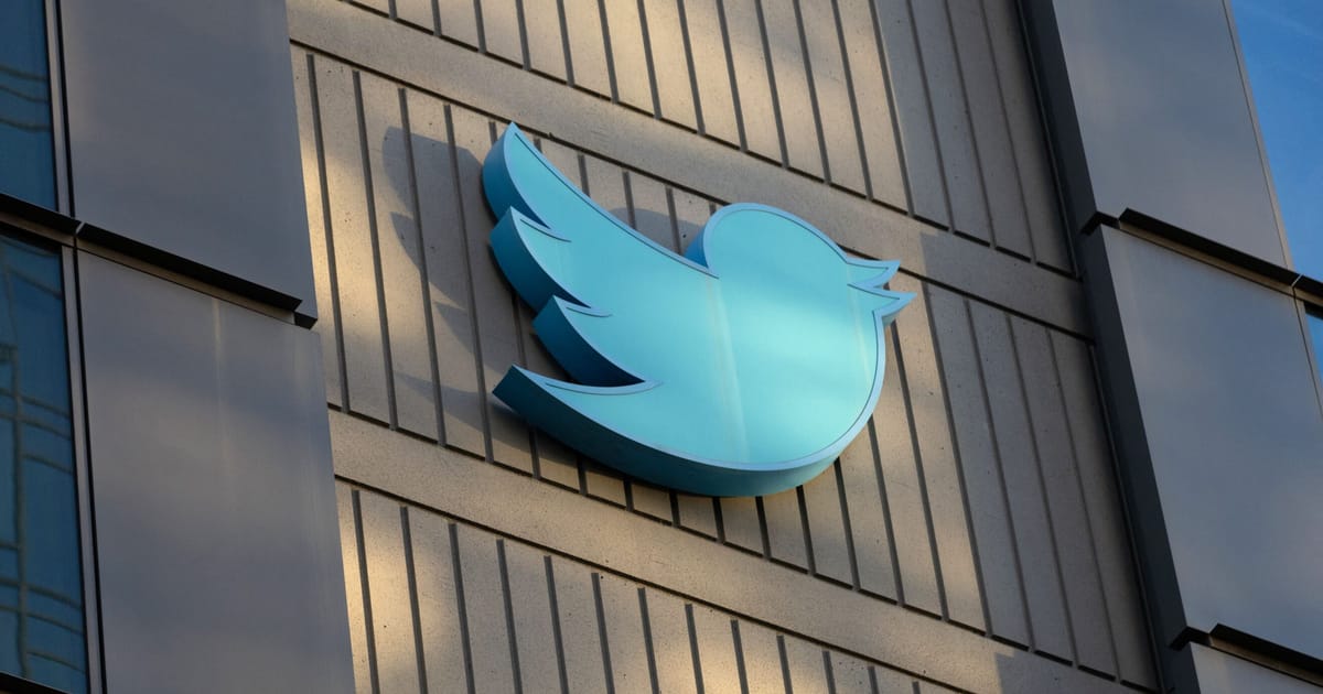
Musk think the problem is the logo. Only if he knew, the logo is fine it is him that people dont like.
The logo has been very successful in branding the company, as well as the companion verb “tweet”. I think a company has reached peak when its name or something connected is used as an action verb. If he had taken over McDs he’d be tossing out the arches and even Big Mac with claims that they are the problem.
Twitter may have not been in great shape financially when he took over, but at least it had somewhat of an image. Musk is the contractor you called to fix a leak in the roof, and he burns the house down. He fixed the leak alright.
Yes, the name of the company, the logo, and the idea of “tweets” are all a charming evocation of a world filled with brief messages. Twitter has problems, but branding isn’t one of them.
But now we can call them “Regretful and sad late-night attempts to get her back” (based on Ex)
I think it’s much more catchy and advertiser friendly than “Tweet” /s
What’s the new word for microblogging on X corp? “Musk x-ed this morning that …”
Funny, because “x-ing out” is what I do whenever I accidentally click on a twitter link nowadays!
Honestly, I would drop the McDonald’s clown. He is weird and some children and even adults are uneasy or outright scared of him.
Honestly the clown has more or less been dropped. I hardly see him anywhere.
They already dropped him for basically that reason back in 2016.
https://www.the-sun.com/money/3419072/why-mcdonalds-get-rid-ronald-mcdonald/
As said, Ronald disappeared a while ago for other reasons, but along with that McD became more of a “modern” look and got away from catering to the family at a kid’s level. They still changed successfully. My point was that Musk would throw everything out and do something totally not designed to bring people to eat there, and then blame everyone but himself. His most successful work seems to be when he lets other run the show, and his real problems started when he forgot that and tried to be front and center on everything without anyone filtering his ideas and verbal thoughts. Elon Musk a decade back would now have a different image had he just hired and listened to a good PR person.
The difference of course is that McDonald’s hired a marketing and PR firm to design a successful marketing campaign as well as a cohesive branding strategy that integrated its online and television advertising with an update of their store architectural design.
Musk on the other hand is basically a wrecking ball destroying Twitter. He is not doing a very good job of reinventing the company and likely scared off any future employees who may want to work there, while being the target of a large class action lawsuit against people who were illegally fired.
Don’t besmirch Ronald like that
Yeah, replace him with Bill Skarsgård!
If he wants to get rid of the bird why is he changing the name to Eggs?
logo 8s fucking perfect. never have i ever doubted that logo or wished it change. it’s Twitter’s while identity. that guy 8s bonkers
He wants to replace it with an X, an x with bent arms in a nice red and white background people will love that it’ll just pop.
Many social apps use blue. Having your suggested colour applied would make sure Twitter is supremely above the others.
He needs to buy Uber next…
X Transport
What is with this guy and his hardon for adding “X” to everything? He’s like a teenager that thinks that adding flame decals to anything makes them “cooler”.
It’s halfway to a swastika.
He’s obsessed with it. His version of PayPal before he merged with the company that became PayPal was x.com and everyone hated it.
Teslax - Ask your pharmacist today what Teslax can do for you.
Teslax gives you erectile dysfunction.
May give you erectile dysfunction…in about 98% of cases.
Literally stuck in the 90s.
I’m so glad we got this instead of solving global warming
Getting rid of the last remaining identifiable part of the company. Genius move.
Actually if he uses a color besides blue/purple it’ll make Twitter stand out from the crowd.
I mean… it’s not going to go well with Elon at the helm, but it’s too early to hate on a rebrand just yet.
it’s too early to hate on a rebrand just yet
There was no reason to rebrand when he bought Twitter. Why the hell would someone rebrand an internationally recognized logo? Especially one that was pretty well regarded just a year ago (at least for a social media site).
It is entirely possible that he just wrecks companies for fun.
This is just what billionaires do nowadays.
What other companies has he wrecked?
I’ve been using a moniker containing two Xs for over two decades. Speaking on behalf of my early-20s self, how fucking edgy do you believe yourself to be as one of the world’s richest persons embracing a single letter as the epitome of logos to represent your umbrella corporation? Hire a branding team, you pathetically dull gen-x neckbeard edgelord manchild.
Seriously, the '90s called a they want their X back.
Elon is the kind of guy who picked a goofy xbox gamertag when he was a kid and never stopped using it. I wouldn’t know.
Me, either.
Well, KaliDOS instead of Xbox, but still…
Just wait until he comes after you for infringing on his trademark 😬
The alphabet will never be the same again. Sesame Street better lawyer up.
Another unnecessary bandaid to Elon’s massive problems. I’d say he should quit while he’s behind, but I love watching him fail.
Elon is a genius! He removed the bird, symbolizing the loss of freedom for its user and his company’s inability to soar to great heights.
The bird leaving indicates an impeding catastrophe about to hit his company and the new symbol “X” is just as clever, because that’s the sign people will click on when they go uninstall the app. Soon, the relationship between Twitter and its users will be nonexistent, just like Musk and his “X” wives
X is closer to a swastika than a bird so it fits
The next update to the logo will be adding 4 more lines…
X is also the name of Twitter’s parent company, x.
Something about canaries in coal mines.
Canary is dead
Pay $44 billion for a well known and popular company, ditch the name and the logo for something totally new and unknown.
So smart.
It’s beyond our thinking. Minimum above 300 IQ needed to understand this.
That man’s got no god damn sense.
I choose to believe he’s just doing this for memes at this point. I can’t accept humans are capable of these depths through inadvertent action, it’s just too dumb.
Do we need to stop calling them tweets then?
The new word will be ‘twats’, after it’s owner
Years ago I used the word “twat” around my girlfriend and she said “you’re pronouncing that wrong”. WTF? I thought she was going to tell me to pronounce it like the English do (“twatt” instead of “twott”) but she said it was actually pronounced “twah” - without the t on the end. Turns out she thought people were trying to use the French word toit. No idea why she thought people were going around calling each other roofs.
Lol
He is completely insane
I think we are in the midst of a worldwide epidemic of mental illness, and even the wealthiest and most powerful are not immune.
I’m here for it…
A ditch would make a much better logo, indeed.


