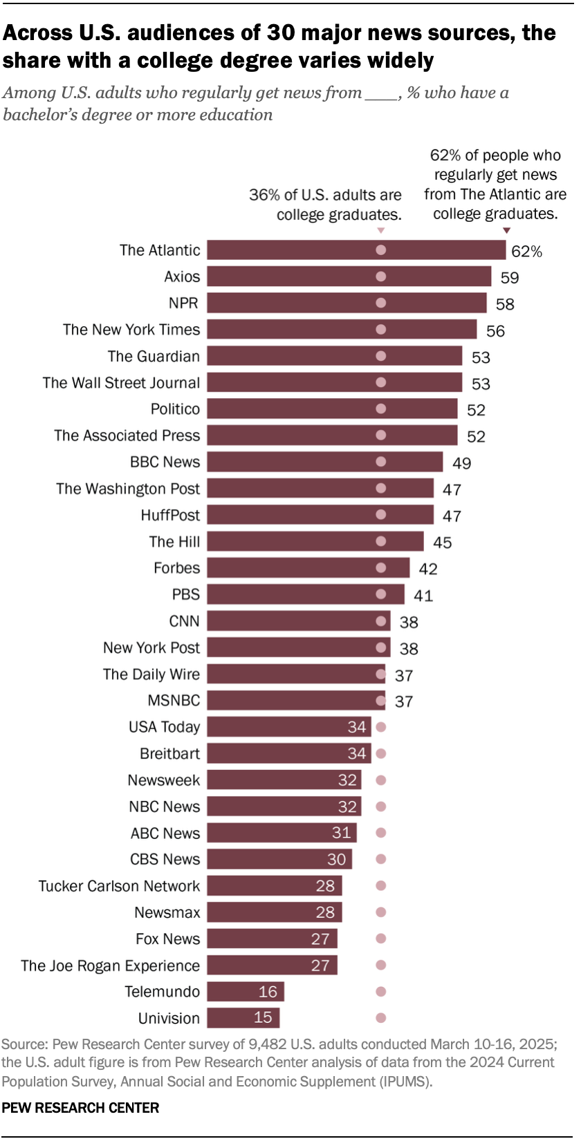
on a scale of all US adults, the percentage who have a college degree
on a scale of all readers who primarily get their news from (given magazine), the percentage who have a college degree
So the scales are still different.
I’m guessing they’d make an argument that: “If the college graduate readership were distributed evenly across all news sources, then (given magazine) would have (the percentage of all US adults who have a college degree).” But the labels don’t say that, which is why it is confusing.

Kind of a weird graph…
But they’re shown on the same bar graph, which implies they’re shown on the same scale. Right? or am I misreading this?
no, “Among US adults who regularly get news from ____, % who hav ea bachelor’s degree or more,” not all US adults with a degree, just all adults
OK you’re right. the scales are:
So the scales are still different.
I’m guessing they’d make an argument that: “If the college graduate readership were distributed evenly across all news sources, then (given magazine) would have (the percentage of all US adults who have a college degree).” But the labels don’t say that, which is why it is confusing.