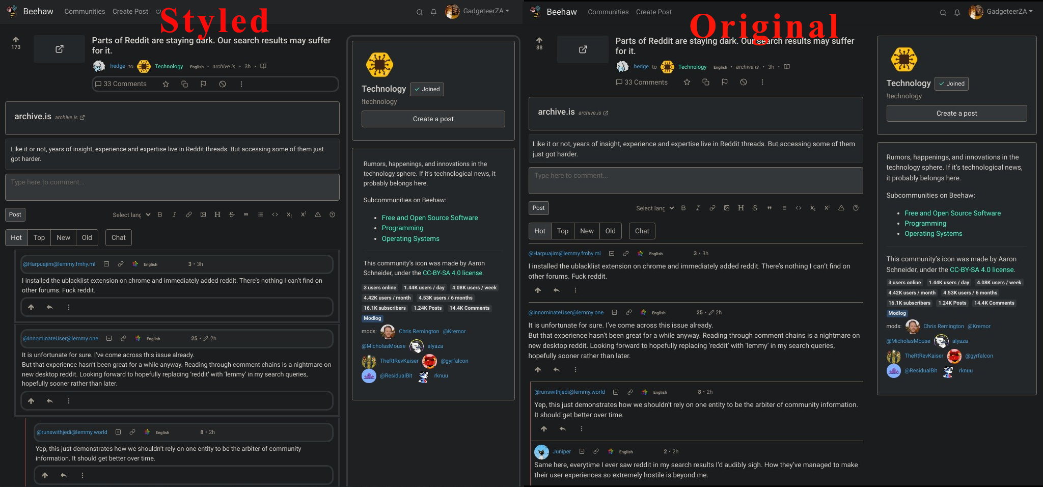
For anyone that would love to get a little more separation/readability out of comments, download Stylebot for chrome or a custom CSS extension for your browser, then use the CSS I wrote out below to get it to look like my screenshot!
Edit: Been making periodic updates throughout the day, and it’s sooo much better now, make sure to use the update code below!
/* ==UserStyle==
@name           LES
@namespace      github.com/openstyles/stylus
@version        1.0.0
@description    A style based on the visuals of RES
@author         Sascha Englert
==/UserStyle== */

@-moz-document domain("feddit.de") {
    div.comment {
        border: 1px solid #ced4da !important;

        border-radius: .5rem;
        margin: 10px 0;

    }

    div.comment-node {
        border: none !important;
    }

    div.details {
        padding: 0 !important;
    }

    div.d-flex {
        justify-content: unset !important;
    }

    button.btn {
        padding: 0 10px;
    }

    div.mb-3 {
        margin: 10px 0;
    }

    svg.icon.mini-overlay {
        color: #f2f2f2;
        background: #ced4da;
    }
}

div.details.comment-node.py-2.border-top.border-light {
  border-style: solid;
  border-color: #ffffff;
  padding:  10px;
  margin-bottom: 2px;
  background-color: #fafafa;
}

div.d-flex.flex-wrap.align-items-center.text-muted.small {
  border-color: #fafafa;
  background-color: #eeeeee;
  border-style: solid;
  padding:  3px;
  border-radius: .9rem;
}

div.d-none.d-md-block.col-md-4 {
  border-style: solid;
  border-color: #eeeeee;
  background-color: #f5f5f5;
   padding:  9px;
   border-radius: .9rem;
}

div.d-flex.justify-content-between.justify-content-lg-start.flex-wrap.text-muted.font-weight-bold {
  background-color: #fafafa;
  border-color: #fff;
  border-style: solid;
  border-radius: .9rem;
}

div.d-flex.justify-content-start.flex-wrap.text-muted.font-weight-bold.mb-1 {
  border-style: solid;
  border-color: #f5f5f5;
     padding:  2px;
   border-radius: .9rem;
}

nav.navbar.navbar-expand-md.navbar-light.shadow-sm.p-0.px-3 {
  background-color: #eeeeee;
  border-color: #fafafa;
  border-style: none;
}

div.md-div {
   padding:  4px;
}

div div p {
  font-size: 14px;
}

div.comments {
  padding-left: 20px;
  padding-bottom:  5px;
}
I always find it strange because dark modes and light text on black backgrounds bugs the hell out of my eyes.
Scrolling with dark mode and suddenly 1000 suns on the screen feels terrible
Just to tag onto this. I found it really frustrating that the navigation header for the site isn’t stickied to the top of the page. I added this to my styles to accomplish that:
nav.navbar.navbar-expand-md.navbar-light.shadow-sm.p-0.px-3 {
    position: sticky;
    top: 0;
    background-color: #fff;
    z-index: 1;
}
Note that if you’re using a theme that doesn’t have a white background (#fff) you’ll want to adjust that value to whatever your background is.
Looks great! Any plans for ‘dark mode’? I would probably use that if so
Side-by-Side screenshot comparison for those who wonder what it looks like…

https://github.com/HrBingR/Lemmy_CSS may also want to get it merged here!
Working great for me on both Lemmy.ml and Beehaw.org. I’m using Dark Reader extension, so it is showing fine too in dark mode for me.
This is amazing! Thank you for making this.
Of course! No problem! :)
Let it all burn down. Leave nothing for the IPO.
This comment may have been posted on the wrong post. I think it is a known issue that they are working on.
Yes, Lemmy was flaking out when I posted this. My comment was directed toward what should happen to Reddit on a different thread.
Oh that’s what’s been happening.
does stylebot work on Firefox and mobile?
Use stylus
This is great. Thanks!


