Hey everyone, I’m back with todays progress update :).
As always, you can try out the newest version for yourself here
Design
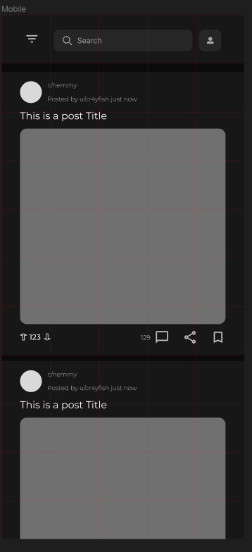
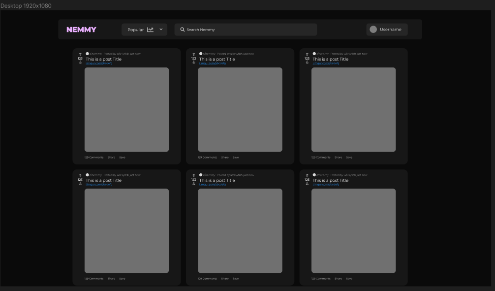
I updated the color palette because the black background was a little harsh on non-OLED devices. So now it’s a little more shaded. The Post and Navigation Bar designs got also a little update.
The new Mobile Design

The updated Desktop design

Roadmap
For now, I will continue working on the Feed design and will also start designing the Post page tomorrow.
After that is done, I will code the login process and then all the features related to a user (e.g. the “Home” feed, commenting, voting etc.).
All-in-all I think it’ll take about a week or so until the features are all there and the design is passable as a prototype.
Well, that’s it for update 2!
Thanks for stopping by and I hope to see you next time :).

