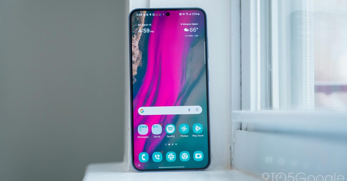
Some more new features including the Samsung’s version of the Dynamic Island have surfaced courtesy of another One UI 7 leak.
What does this have to do with dynamic island? That’s just a clickable notification
Correct. But it doesn’t change the fact that 7.0 absolutely resembles iOS. They continue ruining the drop down panel with each subsequent OS update.
That’s the problem. It looks exactly like what it is. A shitty Apple clone in terms of UI. Not all of it but enough that you can’t ignore.
I had to download a bunch of extra 3rd party apps to get back my old functionality from the last major update where they stole some bits and bobs
Yeah, this is copying colorOS and perhaps other chinese UIs. They have pill notifications.
deleted by creator
Didn’t this already exist in the form of the call chip while you’re in a call?
Can we just keep the stock AOSP ui please? It is great as is.
Except the quick settings
Fuck those
Fair enough.


