

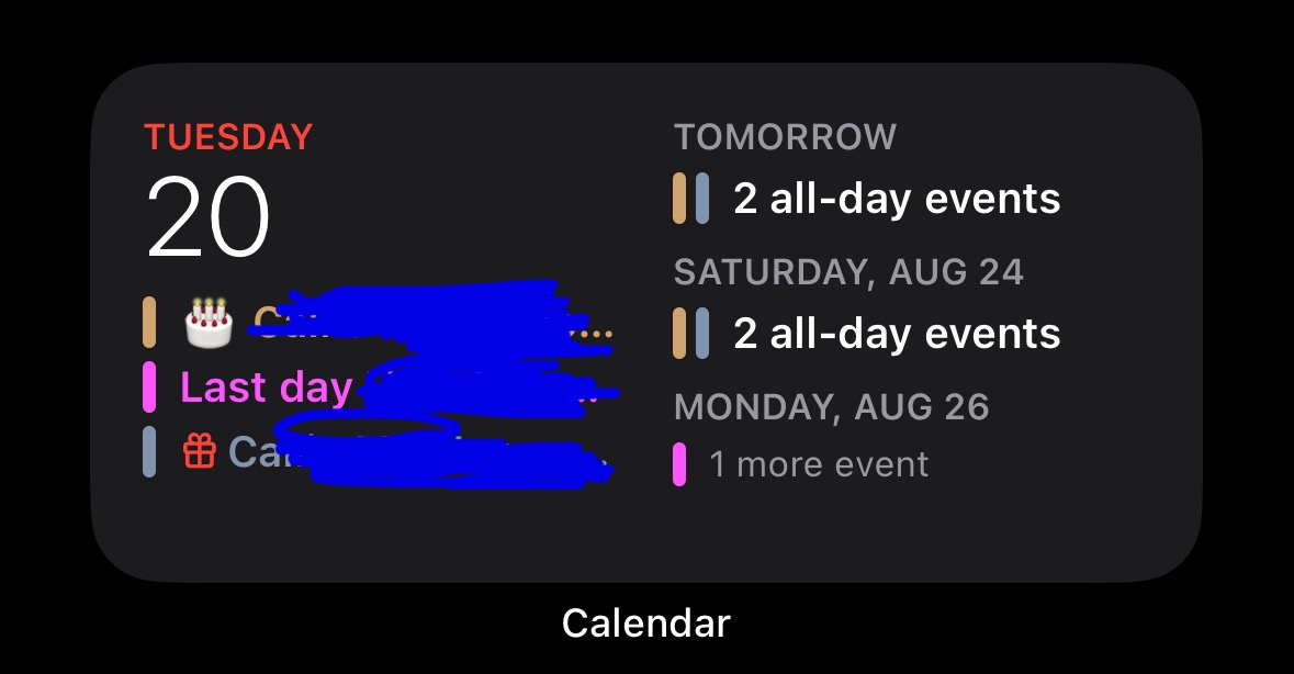
The most useless calendar widget is made by Apple. I constantly forget that someone’s birthday or something important is coming up later in the week.
Now I understand that you can set up alerts and you can set up reminders for stuff. I also understand that you can choose a different size widget. But depending on the size and the amount of events it’s possible it won’t even show you what’s going on the next day in the larger widget as well.
This is forced me to use third-party widgets to display calendar events for the week on my home screen. I hate it because I have no idea if it’s stealing my data.
Bonus Edit! The large widget fails to show you what’s happening today!

It still looks terrible IMO.
Edit:
It’s not differentl. It’s the same as iOS17.
Why it’s terrible.
Edit: I’m familiar with the widget. I don’t need someone explaining to me how to click on a widget. I get it. I also understand it’s different than the one I posted. It’s called “Up Next”.
Despite which one you pick, they’re all poorly designed. It takes up a third of the screen and does a bad job at presenting as much information as possible within reason.
Edit 2: That specific calendar widget you posted from ios18 beta looks exactly the same as it does in ios17. This thread is pointless.
deleted by creator
Tap on it to find out (if this wasn’t an image). I assume there’s a fixed one row of space for an all-day event there. That’s definitely on purpose, considering they even have a toggle switch to completely hide all-day events. Sure, it could be two or up to two elements but that comes at the cost of the detail on the timeline below. They probably considered the timeline to be more important because that changes more often as opposed to the all-day events that only change once per day, and that as a consequence you’re going to check the all-day events once per day (or even just the day before), so you can just tap the widget if you want to see them.
It would be great if it was more customizable in terms of the layout of course, but this is Apple we’re talking about. I’m honestly surprised there’s a toggle switch to completely hide all-day events in the first place.
This one’s a timeline, not a list of events unlike the one in your post, and in that time (8-12 today) there are no events, so it’s blank. It’s as much wasted white space as the full calendar view with no events in it.
Personally I have no problem with the calendar widget, but I have to say collapsing today’s all-day events in the list view as in the OP if there’s space left is questionable at best.
deleted by creator
deleted by creator