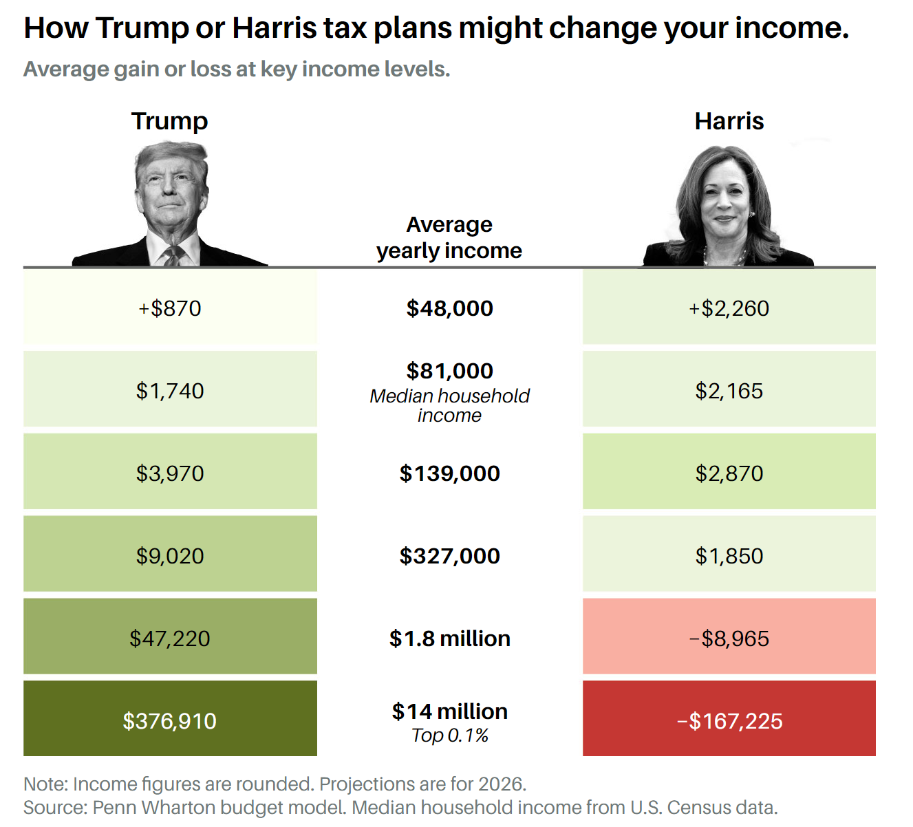
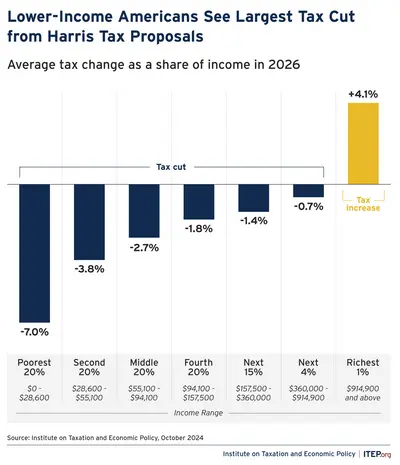
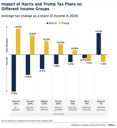
It shows how much money a person of varying income brackets would save under both parties’ tax plans. Thank you in advance.
You must log in or register to comment.
That second graph is a doozy. What is driving the two? I’m assuming the Trump plan involves a cut to capital gains tax?
I am fairly sure these graphs indicate changes only for federal income tax brackets, no capital gains.
Ooh, that’s a handy graph, should be shared with more people who might not necessarily lean Pro-Harris but do care about the economy.
It won’t work. They assume they’ll somehow slide into a higher, benefited bracket if the Republicans succeed. Something about trickling down the wealth but thinking they’re the only ones that’ll be fit, floating them to the top.

Was it this one?
It was, thank you so much!


