56!
they/them
- 0 Posts
- 46 Comments
 2·2 months ago
Sadly KDE is also trying out the “modern” style tabs in some places too:


 4·2 months ago
Right, that makes sense as well. What I was thinking is that the use of the accent colour shows which one is active, though it would probably be less confusing if this wasn’t done with an outline. See the KDE version for example:

Regarding keyboard navigation, I could see this working similarly to radio buttons, where the tab key selects the entire tab group, and tabs need to be navigated using the arrow keys. In this case I think it makes sense to put the focus border around only the selected option, and having the focus border follow the selected option when arrow keys are used. If this is the case, I think swapping the current version does make sense.

 1·2 months ago
If they did the exact opposite of this, I think it would look ok. If I was trying to fix this, I would probably just swap the styles of the selected and deselected states. Maybe it’s a miscommunication between designers and implementers, causing the meanings to be swapped?

 2·3 months ago
Well… I’ve tried to find out just now. Most taller lighthouses are on small rocks in the sea. On some the lighthouse covers the entire rock. I have also discovered that there are potentially taller land-based lighthouses in the uk, this one just seems to be best at advertising it.

 3·3 months ago
What’s wrong with forms?

 17·3 months ago
Inside the fresnel lens of a lighthouse. (The tallest land-based lighthouse in the UK)


From my experience, the large button does the flush, but the size of the flush depends on how far you push it down. The small one simply pulls the large flush button down with it, but stops it from going more than half-way, resulting in a smaller flush.

 61·3 months ago
I believe birds have a very different perspective of harmonisation. What they sing might sound harmonised to them, but not to us (and vice versa).

 4·3 months ago
Toodle-oo (to the loo) as you leave the room. That’s what I say to my cats at least.

 1·3 months ago
I’ve always used Ctrl for that. I had my computer for 2 years before I discovered that Ctrl is the “wake from sleep” key, and no other keys would work anyway. (it’s a thinkpad)

 17·4 months ago
They do? I’ve always seen that as being up to distro maintainers, and out of control of the devs.

 41·4 months ago
My cat is currently sitting on an identical pillow :)
https://rabbit-rabbit.quest/ selects a random location for you to visit every day within walking/cycling distance.
no worries :D
Step 1:
- Make sure you are using the web interface of your instance
- Click on your username in the top right of the screen
- Click on settings
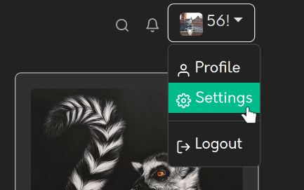
Step 2:
- On the left, click on the tab titled “Blocks”
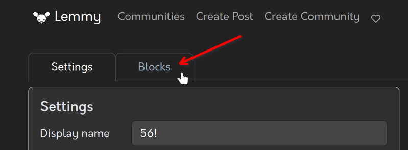
Step 3:
- ???
Step 4:
- Profit
Here are some overly detailed instructions :)
Step 1:
- Make sure you are using the web interface of your instance
- Click on your username in the top right of the screen
- Click on settings

Step 2:
- On the left, click on the tab titled “Blocks”

Step 3:
- Scroll to the bottom of the page. You should find a “Block instance” section
- Select the drop-down
- Start typing the instance’s domain name in the search box
- Select the instance you wish to block from the search results

Step 4:
- Profit

 3·6 months ago
What I feel is missing from the practical suggestions section: why cache images at all? They should be stored on the server they were uploaded to, and nowhere else. The image URL would be attached to the post, and could then be used by clients to fetch the image from the original server.
I thought lemmy did this, but it seems not (any more?).

p2p from behind a CGNAT works just fine as long as a single server is accessible and can mediate connections between other peers. Most non-servers are behind some sort of NAT these days.