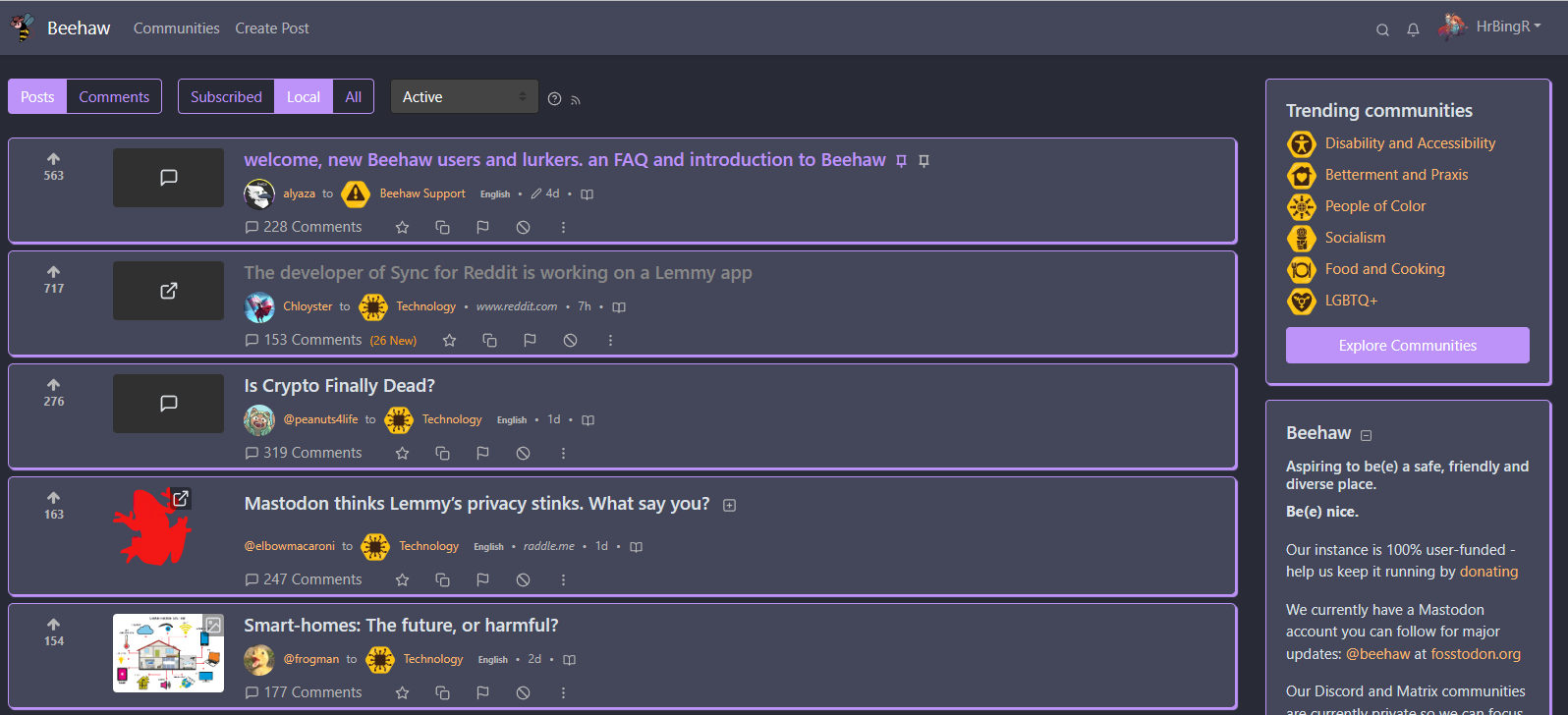
Hey so I made a Dracula theme! Let me know if you think I’ve missed anything or it needs any changes.

Hey so I made a Dracula theme! Let me know if you think I’ve missed anything or it needs any changes.

I love these videos from Josh
Alright, I’ve added some ‘quieter’ options that look a lot less colorful for those that want something a bit more subtle, both for the light and dark themes. Thank you for the feedback!
Okay that makes sense, will try to create a few more subtle themes, thank you!
I’m sure that could be arranged! Will take a crack at it once I’ve got a bit of time
I can take a look when I have a bit more time, otherwise feel free to make one and submit a pull request :)
I’ve accepted your pull request, and added new folders for litely/darkly themes, as I do plan to expand on the dark themes as well, just to make it clearer to anyone visiting which themes are for which :)
That’s awesome! You’re more than welcome to submit it to the repo as well if you want to, otherwise I’m glad other people are doing Lemmy theming as well - I’m all for expanding user choice.


Hey so I setup a repo; swap to the default green litely theme, and then test a few of these out, I think they turned out quite well!
https://github.com/HrBingR/Lemmy_CSS/
Please feel free to submit pull requests if you have other colors or ideas you think would look nice. The more the merrier!


I was thinking of creating a Github repo for it, maybe make a few different theme variants as well for people that’d want different than the standard two colors etc. Might take a crack at it, will let you know.


Glad you like it! :)


Hey so just a heads up, I made a few more changes that I quite like (again, for the red theme, tweak appropriately for the default green theme), so thought I’d just update you.
This changes the main feed quite a bit, adding a bit more of a card-like design to posts, though I have done my best to make sure there isn’t too much white-space from this change, I just feel it looks a bit more modern, but again, feel free not to use it :)
It also, and this is my favorite change, changes the title color of any post you’ve visited, something that I feel is basic but for some reason Lemmy didn’t have before. So now any posts you’ve visited before will be a light-gray color instead. Hope you find some value here.
.container-lg {
    max-width: 1600px;
}
.col-md-8 {
    max-width: 80%;
    flex: 0 0 80%;
}
.col-md-4 {
    max-width: 20%;
    flex: 0 0 20%;
}
.col-sm-2 {
    max-width: 10%;
    flex: 0 0 10%;
}
.col-sm-9 {
    margin-left: 5px;
    max-width: 80%;
    flex: 0 0 80%;
}
.post-listing {
    border: 1px solid rgba(34,34,34,.125);
    /*border-bottom: 0px;*/
    border-color: #c80000;
    border-radius: 5px;
    margin-bottom: 8px;
    padding-top: 10px;
    background-color: #fff;
    transition: all .2s;
    box-shadow: 2px 2px 1px #c80000;
}

hr {
    display: none;
}
.border-top {
    border-top: 1px solid rgba(34,34,34,.125)!important;
}
.border-light {
    border-color: #e4e4e5!important;
}
body {
    background-color: #ecf0f1;
}
.navbar {
    background-color: #fff;
}
.card {
    background-color: #fff;
    box-shadow: 2px 2px 1px #c80000;
}
.col-12 .card {
    box-shadow: none;
}
.comments {
    padding-left: 10px;
    background-color: #fff;
}
a:visited .d-inline-block {
    color:#d6d7d9!important;
}
.my-2 {
    margin-bottom: 0px!important;
}
ChatGPT can be a handy way to get certain information as well.


Factorio works well (at a smaller scale).


Hey there, sure, currently I’m using this. The border between comments on a comment thread doesn’t look the best, but it makes it easier for me to track comment levels so I like it, though there are certain properties I’d like to change but can’t.
Either way, I’m using an extension called Amino to apply my CSS changes on a domain-level.
This fixes a lot of the whitespace and borders to make differentiating between posts and comments a little easier, while minimizing white space. I think it looks nice.
EDIT: I’ve made a few more changes in terms of color.
.container-lg {
    max-width: 1600px;
}
.col-md-8 {
    max-width: 80%;
    flex: 0 0 80%;
}
.col-md-4 {
    max-width: 20%;
    flex: 0 0 20%;
}
.col-sm-2 {
    max-width: 10%;
    flex: 0 0 10%;
}
.col-sm-9 {
    margin-left: 5px;
    max-width: 80%;
    flex: 0 0 80%;
}
.post-listing {
    border: 1px solid rgba(34,34,34,.125);
    border-bottom: 0px;
    border-color: #c80000;
    padding-top: 10px;
    background-color: #fff;
}
hr {
    display: none;
}
.border-top {
    border-top: 1px solid rgba(34,34,34,.125)!important;
}
.border-light {
    border-color: #e4e4e5!important;
}
body {
    background-color: #ecf0f1;
}
.navbar {
    background-color: #fff;
}
.card {
    background-color: #fff;
}
.comments {
    padding-left: 5px;
    background-color: #fff;
}


If we could end up with a theme that looks a lot more like https://kbin.social, I’d be so happy. My biggest gripe with Lemmy is all of the white space, and none of the current themes improve that at all. All of the theme options offered by kbin look amazing by comparison, and to my understanding Lemmy theming is done via CSS based on Bootstrap v4, so new theme creation should be straightforward enough.
It’s to the point where, when visiting Lemmy instances, I use a custom CSS extension to modify a few properties to make it a bit more palatable to me.
If you guys ever need help creating custom themes to offer to users I’d be happy to contribute.
Logistic bots are a game changer. For real.