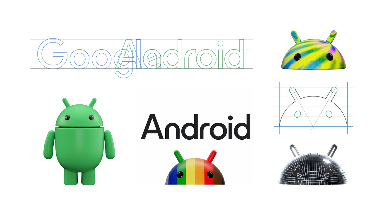
From a design perspective, it’s awful. You don’t combine 2 similar but different fonts, with the same sizing and color, into one graphic. FFS it even has serifs AND sans serifs in the same bloody word.
Idk, I feel like Google has tested this stuff and it might just look better this way. For example, the G in Google isn’t perfectly circle nor are all the colors lined up correctly. Ironically, it’s slightly oval to optically make it look more circular.