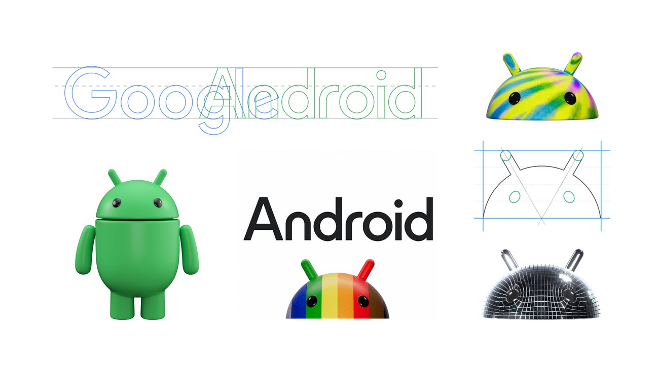
The bugdroid is now in 3D lol
So we got away from the 3D style just to go back to it?
Not to mention how that had an android generator app thingy around 2.2 but after a short time stopped updating it then pulled it from the store.
Those new animations seem pretty oriented toward video ads.
To me this screams AR/VR focus in the next versions, I think they want to go after Apple’s Vision Pro and do kind of like they did a few years ago when they brought some depth to the MacOS icons
Not seeing the improvement. Looks like change for change sake.
Looks like change for change sake.
GUIs swing back and forth between 3D and flat ever since Microsoft released Internet Explorer 4 for Windows 95 which introduced flat GUI toolbars. That watercolor Office release had the look planned for WinXP but Apple released Mac OS X with its (for that time) super realistic 3D icons and GUI widgets and Microsoft wanted to counter that. In fact, most such changes were initiated by Apple and were never about functionality.
it does match Material You better imo
Don’t see why they couldn’t just spew iterative inclusive designs over the 2D one, this is kind of badly animated and has a 00s vibe to the concept. The disco ball-skinned and spiky mohawk examples are downright repulsive designs
Waiting for the people who keep saying logos are just getting simpler and simpler
“pLeAsE dOn’T tUrN mE iNtO aN oVeRsImPLifiEd LoGo”
I guess some designers needed to prove that Google needed them, or just had enough time for a vanity project.
I hate everything about it.
Looks like Android put on some weight.
a » A
The one on the right is a dalek
They call the droid a bugdroid? Interesting name choice as a software bug normally isn’t a good thing.
From a design perspective, it’s awful. You don’t combine 2 similar but different fonts, with the same sizing and color, into one graphic. FFS it even has serifs AND sans serifs in the same bloody word.
Idk, I feel like Google has tested this stuff and it might just look better this way. For example, the G in Google isn’t perfectly circle nor are all the colors lined up correctly. Ironically, it’s slightly oval to optically make it look more circular.
Ew.
It’s fine. Very much AR-vibes like others say.
They basically capitalized the A in Android lmao. I didn’t even know they officially uncapitalized it in 2019. Realistically the font change isn’t all that different and I don’t think many will care about that as much as us nerds do.
Just when you think abortion is under threat, one shows up in the Google Play store.
Whoa! Let’s watch our word choice! Google doesn’t abort things!
They keep them alive for 9 months and then will unceremoniously dump the corpse into a nearby river. Their PMs don’t see the fun in killing something unless it’s already been adopted by consumers.


