You must log in or register to comment.
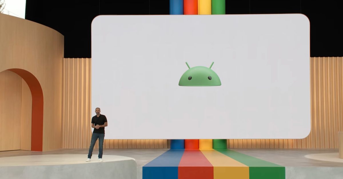
A redesign I don’t immediately hate? I really hope this is a return to more 3D logos and UI elements, not a fan of how flat everything is nowadays.
I really, really don’t like it.
It feels like Windows Vista to me. I hate it.
i like it. i’m glad to see a bit of depth and personality coming back into the design à la mode
Maybe nostalgia but I love the old Android wordmark


