Ɀeus
fortune favours the bold, but i favour the italic


- 0 Posts
- 12 Comments

 1·1 year ago
ideally, [!community@instance.tld](/c/community@instance.tld) - that way the link works for everyone. howevery, the web interface does this automatically if you start typing !community
slide had a “similar” thing, so slide for lemmy probably will; but it’s in very early development and that feature doesn’t yet workedit: never mind, i just saw your comments on that sub so i guess you already knew about it
i say /fɛdˈɪəː/
hope this helps!
like grenadier or bombardier, i guess?
sublemmy is cute, trips off the tongue, and can be shortened to sub. community is more awkward to say, and shortens to comm or commie. c/ (cee-slash?) is just awful. until someone suggests something better (lemmons? lemmunities?) i’m going to keep using sublemmy
edit 2023-07-17. i have settled on lemmysphere. it is a pun, and i like it
 1·1 year ago
i wouldn’t even mind the colours if they didn’t tint the background. tinting solely the main text colour and the main buttons might look quite nice. to be honest though, i just loathe pastel colours in general, so it’s possible that’s influencing my opinion
yeah, i hated material ew as soon as it was announced. so much padding everywhere, and so little contrast - to paraphrase the incredibles: if everything’s orange[1], nothing is. your eyes will adjust to it. i want actionable items to stand out, not be a slightly lighter shade of the same colour. it also looks rather like a fischer-price my first phone interface
i must say, if an app (for example, jerboa) uses material 3, i usually try to look for an alternative
[1] other colours are available, i just like orange
edit: some examples:
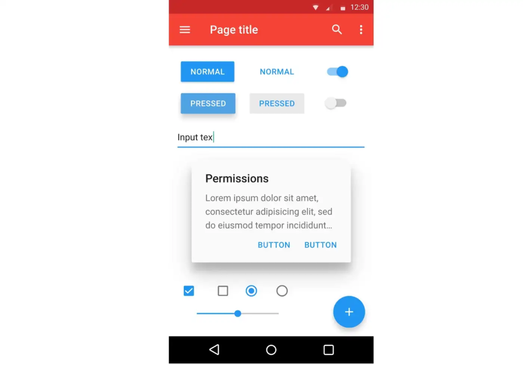
with material design, it’s clear what’s a header, what’s a footer,[2] and what each button’s state is.
with all the padding, there’s also less space; leading to less functionality
with material ew, it’s much harder to tell at a glance what each app is, one has to scrutinise the icon rather than just tell at a glance by colour
i also really dislike monet; the way it pulls this horrible washed out sickly pastel colour from a wallpaper and washes it over the entire app. if i just pulled one accent colour, and applied that to, say, the header and main action button, i’d like it a lot more
[2] look at the lack of contrast on that “new post” button
i like it. i’m glad to see a bit of depth and personality coming back into the design à la mode
 1·1 year ago
i imagine a fedisearch engine will come out that can search lemmy, kbin, mastodon, etc. efficiently; so instead of googling “how to x site:reddit.com”, we’ll just fedisearch “how to x”
in fact, i’m pretty sure i already found one but it wasn’t very good, and i’ve forgotten it’s name
i do like the RES feature of personal counts though
if someone on res had a [+10] next to their name, i’ll know i personally respect their opinions, even if i don’t remember their name. similarly, if they have a negative number, i’ll know not to engage as they’re probably a troll
the “risk” of false positives comes down to the consequence. if the consequence is being stuck in the slammer, don’t use ai. if the consequence is you can’t upload the image unless you manually appeal, or even maybe have to use an external image host; i think ai is fine
edit: ah bugger, wrong acct. ah well
(please tag @zeus@lemm.ee if you want me to see your response)