
Are you guys tired of the “Material You” design? I don’t really like the huge paddings on everything aspect of it. Also a lot of it feels too flat. What do you guys think?
I’m not upset by it because, like all Google design eras, nearly no one uses it uniformly.
yeah, i hated material ew as soon as it was announced. so much padding everywhere, and so little contrast - to paraphrase the incredibles: if everything’s orange[1], nothing is. your eyes will adjust to it. i want actionable items to stand out, not be a slightly lighter shade of the same colour. it also looks rather like a fischer-price my first phone interface
i must say, if an app (for example, jerboa) uses material 3, i usually try to look for an alternative
[1] other colours are available, i just like orange
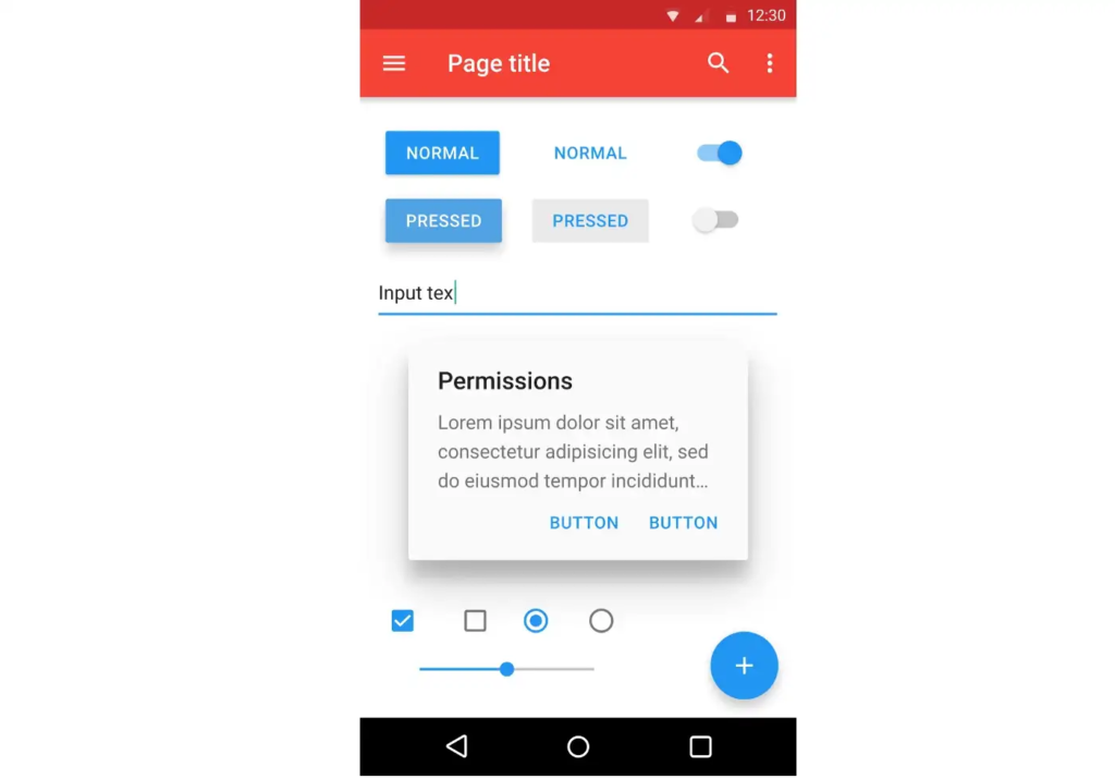
edit: some examples:
with material design, it’s clear what’s a header, what’s a footer,[2] and what each button’s state is.
with all the padding, there’s also less space; leading to less functionality
with material ew, it’s much harder to tell at a glance what each app is, one has to scrutinise the icon rather than just tell at a glance by colour
i also really dislike monet; the way it pulls this horrible washed out sickly pastel colour from a wallpaper and washes it over the entire app. if i just pulled one accent colour, and applied that to, say, the header and main action button, i’d like it a lot more
[2] look at the lack of contrast on that “new post” button
The colors I do like personally, it’s the huge buttons that make me feel like it was made for the elderly lol.
Its nice to see everyone has their own take. :)
i wouldn’t even mind the colours if they didn’t tint the background. tinting solely the main text colour and the main buttons might look quite nice. to be honest though, i just loathe pastel colours in general, so it’s possible that’s influencing my opinion
Design preferences has a tendency to be “cyclical” appearing to be tiresome. That’s fine and an encouraged strength of customisablility.
The issue is unified design language across android devices. Material You attempts to solve this to limited success. But it’s better than the alternatives I’ve seen in the past.
The over-padding (especially default widgets) is something I take issue with but it’s a preference and can easily be adjusted.
I love it. Personal preference, of course. :)
No, not at all. I am really fond of Material You. I think it is a nice mix of modern and playful. The colors are great too. I seek out applications that adhere to the material you standards and allow for using system colors. I have a Pixel 7 and a Pixel Watch. I’m excited to see what Material You looks like on the watch when the Wear OS 4 update comes.
I’m personally not that fond of it, and kind of want it to blow over in favour of a new trend.
It lacks the charm, and neat little 3D effects that skeumorphism had, but that’s also not helped by it being implemented poorly.
Android 11 was the last best Android version in terms of UI
I like it, I don’t know
I actually like it very much!
I didn’t like it a ton initially, but after seeing the new Sync for Reddit redesign, and seeing how perfectly they’ve implemented it, I love it. Props to the Sync dev, they really got the idea behind Material You. Can’t wait for the alpha of Sync for Lemmy.
My only issue is not easily being able to scroll to the bottom without overshooting to flip pages. I hate not being able to flip pages from the top, but not being able to quick scroll to the bottom too is really counter intuitive.
Absolutely like it. This design is very cool and has huge potential
Wasn’t a fan at the beginning, now I think it’s great.
There will always be a need for a one-size-fits-all design, and I think it works well enough for that.
But yeah, I wish more apps took the extra step to specialize their layout to fit their own usage. Sometimes you are dealing with a lot of data and it helps to have different borders and less margins.
The only thing I hate about MY is its comically big quick settings. Give me back the Android 11 quick settings and it will be fine (the Internet QS be damned)


