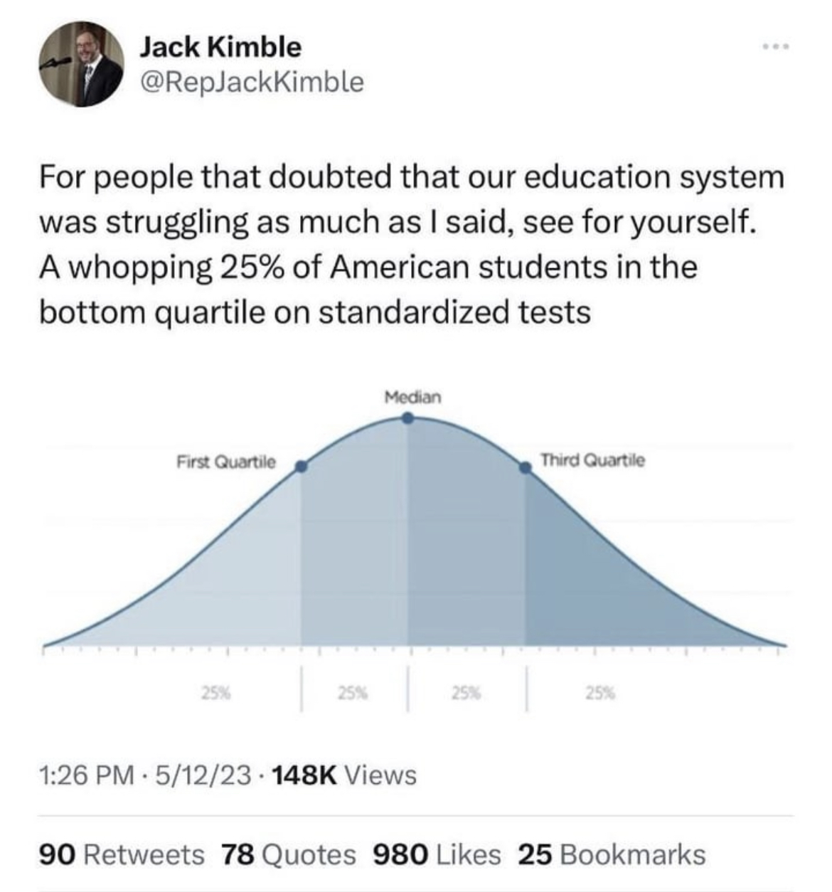
No, this is how a graph showing quartiles will always look because quartiles, by definition, always include a fixed percentage of the studied population under them.
In this case the lower quartile will always have 25% of the population under it, 50% under the second quartile, and 75% under the third quartile.
Quartiles break a population into 4 equal portions.
I know what this graph is, I was talking about a graph that actually showed something useful. If you’ve got a couple of hours to learn something useful then you could do worse than to look at this video: https://www.youtube.com/watch?v=UBc7qBS1Ujo
Spendrill is not misunderstanding the OP. He’s just saying that if intelligence could be measured by a better metric, then distribution of that metric among the population would not look as smooth as the one in the OP.


No, this is how a graph showing quartiles will always look because quartiles, by definition, always include a fixed percentage of the studied population under them.
In this case the lower quartile will always have 25% of the population under it, 50% under the second quartile, and 75% under the third quartile.
Quartiles break a population into 4 equal portions.
While that’s true, the actual empirical curve does not have to be smooth. Or gaussian.
I know what this graph is, I was talking about a graph that actually showed something useful. If you’ve got a couple of hours to learn something useful then you could do worse than to look at this video: https://www.youtube.com/watch?v=UBc7qBS1Ujo
Spendrill is not misunderstanding the OP. He’s just saying that if intelligence could be measured by a better metric, then distribution of that metric among the population would not look as smooth as the one in the OP.