

I remodelled my baby’s mobile for exactly this reason. Seemed stupid to have the animals face up when baby is underneath, so I turned them round and made them detachable so baby could pull them off and play with them too.
Subscribe.
Uh… Uh… Uh…
Thanks for the link! Hadn’t found this one yet.
That’s how I developed my lifelong love of buttholes.
When the project manager forgets that the users are stakeholders, and are entitled to representation and influence.
The UI of Youtube is actually not bad. What is bad is how the search function has gone to shit, constant promotion of youtube Shorts taking up half the screen, and the algorithm getting steadily worse at recommending videos.
The interface itself is pretty easy to navigate.imo loading several video recommendations while im just scrolling through comments is very bad, especially because the API calls are seperate and load both sides seperately. huge waste of bandwith when im only interested in the text, which is barely any bandwidth
Youtube 2012 loaded in 1 second on a 5MBit line. HTML, CSS and JS for a page was a few hundred kilobytes.
You can profile the current “responsive” version in your browser. It might not look horrible but it’s a technical abomination. I doubt it’ll even load anymore in a browser from 2012.
100% certain that if they kept their 2012 UI, we’d be complaining about how outdated their UI is.
No? That would be true if we were the Twitter community. But, for Lemmy, I am pretty sure most people that are on Lemmy fancy Reddit’s outdated old.reddit.com UI as well because it’s more simple. Things are much lighter, but still work.
deleted by creator
I do feel like the mobile app has been getting progressively buggier over the last year. Maybe it’s just me but the mini-player has been glitching out for months and other weird stuff has been getting more prevalent like yesterday I had the YouTube play button icon stretched and distorted as an overly across the whole app until I restarted it and creating a queue didn’t work until I started a new video manually.
I couldn’t tell you. I ditched it for GrayJay since it was in alpha and couldn’t be happier.
I really don’t like how hitting the back button minimizes the currently playing video instead of going back to the previous played video, personally
You forgot Quora. That site used to be semi-useful. These days I can never tell whether I’m reading an actual answer to the question or just some random recommended post that’s been shoved in in between.
Right? Whenever I go on Quora I have to double-check whether the response I’m reading is actually the answer or just another post
I think Quora is on another level. It’s a weird zombie site these days
Just use a 3rd party a…h, crap.
It’s actually optimized for them. The goal is to get users to spend time and see ads etc. The UI is not made for us users.
Just like cellphones.
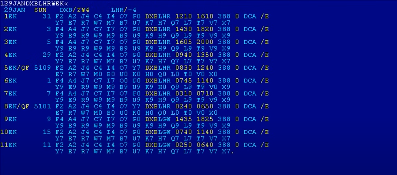
SAP: “Step aside, kids”
Guess it doesn’t look like this anymore:

Hahahahaha. I hate SAP with a burning fury. I’m not sure if it’s looked like this for a long time as I’ve only been in my career three years, but yep yep yep yep, looks exactly the same.
Then it’s looked like that for at least a decade, nice.
Imagine they have new versions with new UIs, but legacy businesses ain’t gonna pay for those upgrades and retraining and re-integration costs!
Haha, you think those are bad? Try any professional tools, like CAD’s, DAW’s, or 3d modelling software.
Or, even worse, any internal corporate software, the bigger and the older the company is, the better… at being the worst, that is.
Or. actually, just go to an any airline’s office to buy a ticket and witness the atrocity they have on their monitors. No, those are not blue screens of death. That bunch of gibberish is the actual UI. And the only way to interact with it is by typing in commands that read like something that Lovecraftian creatures would sound like.
I haven’t tried many CAD softwares but AutoCAD has really intuitive UI. I used to be able to find most things by just thinking what tab it should be based on what it is. It actually inspired me to learn better programming and software design to make something intuitive. I haven’t used it in years since I came to Linux so as long as they haven’t changed it.
Are you a zoomer? Command line is way better than a billion little buttons
Those systems are so much faster and more reliable than the bubbly shit we have now. All that crap on the screen is what we call “information density.” It’s designed for people who work with it several hours a day and understand it, not for some random to be able to learn in 15 minutes. It has a longer learning curve, but is way more efficient in the end.
deleted by creator
Yall must not work in manufacturing.
How many of your machines use Comic Sans font on the operator touchscreen?
And how many times has someone had to pull the PLC programming to resize the button clip art jpegs to fix and overlap that caused the machine to run 2 different functions at the same time if they tapped too close to one side?
Let’s add google drive.
I hate their ui.
Can someone tell me how to force Google drive to show me folders instead of files on start? Why would I ever need to look at a mess of files? I spend time organizing them into folders a reason, no thanks Google I really wanted them haphazardly thrown in my face.
Is this the setting you’re talking about?
The worst thing they did with the UI which OneDrive also does, is take the universally understood concept of “Saving” and make it mean 5 different things within the same program.
I’m not seeing “Amazon” or the plethora of online shopping stores that have followed in its footprint of complete and utter shit. To this day, I can’t understand how Amazon became so big with a user interface so fucking awful but goes to show it doesn’t actually fucking matter.
Amazon UI is so bad if you type ‘subs’ in the product search it auto-suggests ‘subscriptions on my account’ and a dozen ‘subscribe and save’ variations because people wind up using the product search trying to find that stuff.
Oh, I had that problem too, try changing your search to “bottoms” 👍
GIMP
How do you have these listed and not the myriad of FOSS products that are garbage to use.
Y’all remember mumble? Easy peasy compared to discord amirite?
GIMP looks a lot nicer than it did 20ish years ago, but it’s still really really bad.
I can somewhat forgive FOSS tools for having poor UI, but GIMP is one tool that really should have some love poured into the UI and how usable it is for power users.
GIMP does look better now, but I feel like its workflow is actively working against the user experience.
Tip: Type / in GIMP for a command palette
I know this is a slightly different category, but Snapchat’s UI is absolutely the worst- far worse than all of these. It’s my go-to UI to pick on.
Youtube is not bad, but Discord makes me feel like a boomer.
I really don’t get Discord. Why would I want all of my chats in different top-level sections? I much prefer just having a list of groups that I am a part of. I do like sorting them into priority and low priority but that is all I want and it is independent of “server”.
Clearly you haven’t used anything from Atlassian or Microsoft yet.
Atlassian ain’t that bad, but yeah, Microsoft really sucks at UI/UX design
Atlassian might not feel bad, but their products absolutely have gotten worse with every redesign. They used to be functional, now they’re just flashy.
Atlassian is flashy?!? Jira is soooo bad.
Well thankfully I didn’t have to use their stuff since 2020. But back then, it really wasn’t that bad.
deleted by creator
I hate the fact that we need to use their shitty GUI in the first place, why can’t this be done with commamd line tools or by editing configuration files? Something like Ansible would also be great. These are some of the reasons why Windows absolutely doesn’t belong on servers and why Linux is just superior.
deleted by creator
I mean, surely it can be done, but it’s not a good experience. Simple unix-like configuration files are much better. Yes, I tried Ansible with PowerShell on Windows, it was horrible. I don’t recommend it.
Discord was a train wreck from the off
Not sure where the discord hate is coming from (besides the new mobile app). If you’re someone who has to use Teams for work, surely you’d kill to switch to Discord instead.
I honestly like the new mobile experience. It seems more tidy.
When people say that it’s “literally unusable” I’m like “what the fuck were you using it for?”
deleted by creator
Imo it was unusable when the new UI just came out. It was sluggish af, and would take significantly longer to cold start.
I still don’t like how a lot of buttons that used to be easily accessible from pretty much anywhere are now behind submenus or flyouts or whatever, but at least it’s usable now.
Yeah they had a bad rollout of the new UI but now it’s okay. Not great but I’ve seen far worse
Thank god someone mentioned Teams. I don’t have it on mobile anymore, but the desktop app is insane.
I have always hated discord’s interface. Just because something else is worse doesn’t give Discord a free pass.
What do you use? Skype, teamspeak, mumble, ventrillo were all blown out of the water by discord imo, except for niche things like the whisper feature on ts for large groups
Discord, cause everyone is there. Curse Voice had it stomped by miles, any chat room had the chatroom feature beat, anyone could design a better UI, but it has everything in the same place, and I think being free and custom bots gave it critical mass.
Doesn’t mean it’s good.


