

- cross-posted to:
- programming_horror@programming.dev
- cross-posted to:
- programming_horror@programming.dev
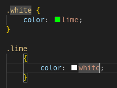
I am not allowed to credit the site that has this disaster. Its owner said “Nobody should see that”
I am not allowed to credit the site that has this disaster. Its owner said “Nobody should see that”
Worse.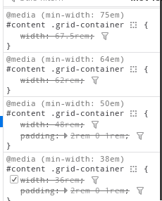
I don’t get it, isn’t this a pretty normal way of using media queries. Granted you’re more likely to see the widths defined in px.
Nowadays we do responsive webdesign instead of micromanaging widths.
This is technically responsive, but I think you have a fair criticism. A single rule like this would be much more maintainable:
#content .grid-container {
	width: 90vw;
	min-width: 12rem;
	max-width: 75rem;
	padding: 2rem 0 1rem;
}
Obviously, media rules have their place, but not for something that’s consistantly a full width container like this seems to be.
Isn’t cascading styles the whole point of Cascading Style Sheets?
You absolute fool. You must never utter its full name, lest you summon its wrath!