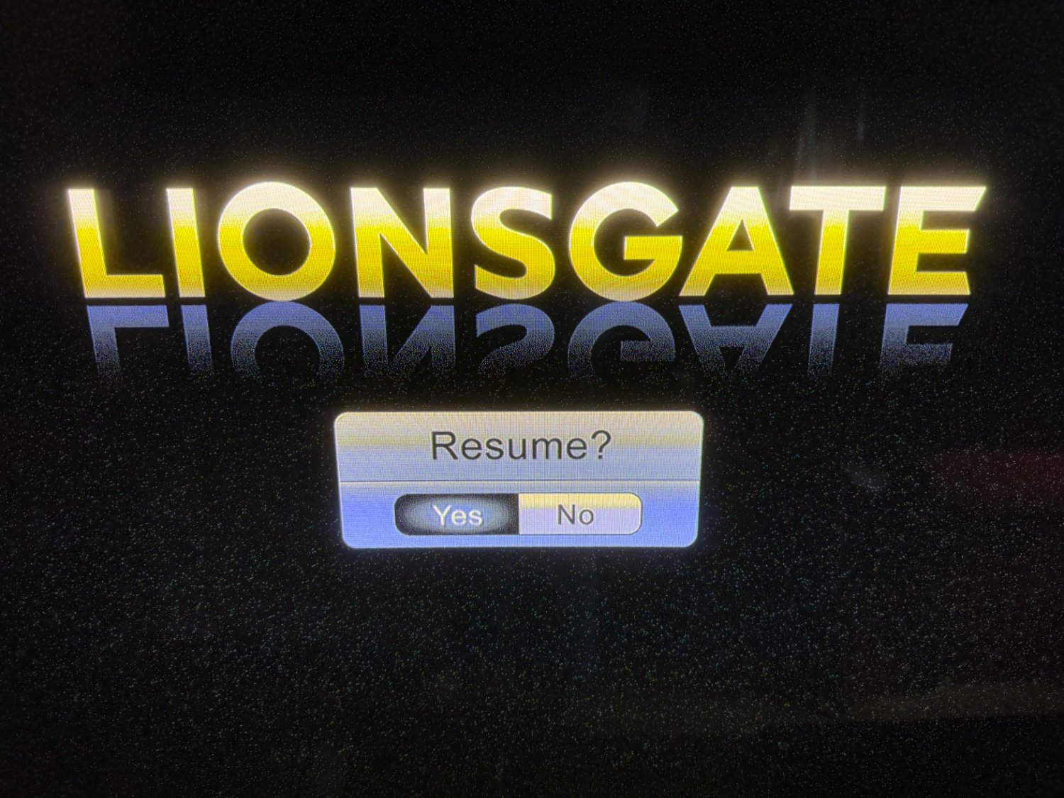
andrewta@lemmy.world to No Stupid Questions@lemmy.world · 9 months agoWhich one is selected? The "Yes" option or the "No" option?lemmy.worldimagemessage-square51fedilinkarrow-up1246arrow-down113
arrow-up1233arrow-down1imageWhich one is selected? The "Yes" option or the "No" option?lemmy.worldandrewta@lemmy.world to No Stupid Questions@lemmy.world · 9 months agomessage-square51fedilink
minus-squarekaffiene@lemmy.worldlinkfedilinkEnglisharrow-up4·9 months agoFunny. I thought the No was selected
minus-squareMTK@lemmy.worldlinkfedilinkarrow-up6arrow-down1·9 months agoI think that might be because modern UI tends to move away from 3d and insted highlights the selected button (making it lighter in color)
minus-squarekaffiene@lemmy.worldlinkfedilinkEnglisharrow-up5arrow-down1·9 months agoYeah I think that’s the problem here. Older uis leant into the faux 3d thing whereas modern designs are mostly flat/minimal

Funny. I thought the No was selected
I think that might be because modern UI tends to move away from 3d and insted highlights the selected button (making it lighter in color)
Yeah I think that’s the problem here. Older uis leant into the faux 3d thing whereas modern designs are mostly flat/minimal