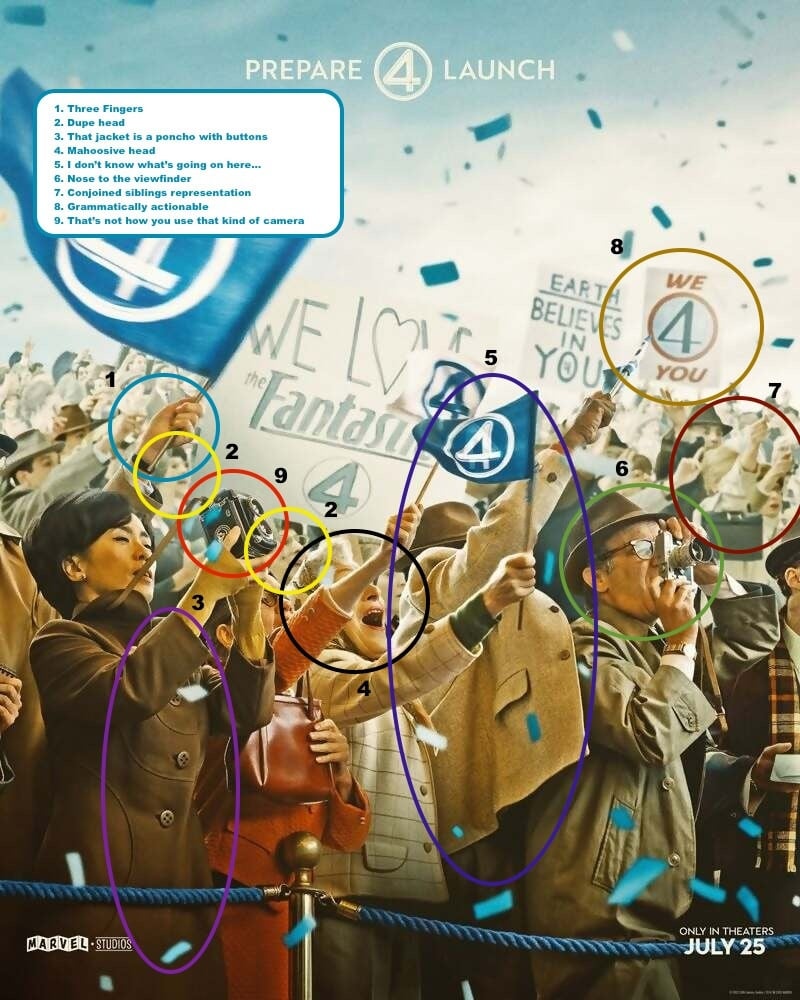
In response to a wave of backlash this morning, Marvel has denied the use of AI in the creation of a new “Fantastic Four: First Steps” poster.
This all just looks like humans over analyzing the shit out of every piece of art now and anything that’s not perfect is now the result of AI. The “we 4 you” is obviously on purpose a cutesy version of “we ❤️ you.” Anyone who argues otherwise is an idiot.
Except for calling people who argue with you idiots, I agree with you. This looks like a Photoshop job, AI is way sloppier.
I’m sorry, but only an idiot could think that “we 4 you” is some kind of AI slop. It’s clearly intentional. Humans do that exact kind of thing all the time. People are looking for reasons to be angry and all those things pointed out are borderline at best. That piece is clearly intentional.
Especially since one of the background banners has a perfectly normal sentence on it.
The duplicate face is more of a Photoshop fail than AI…
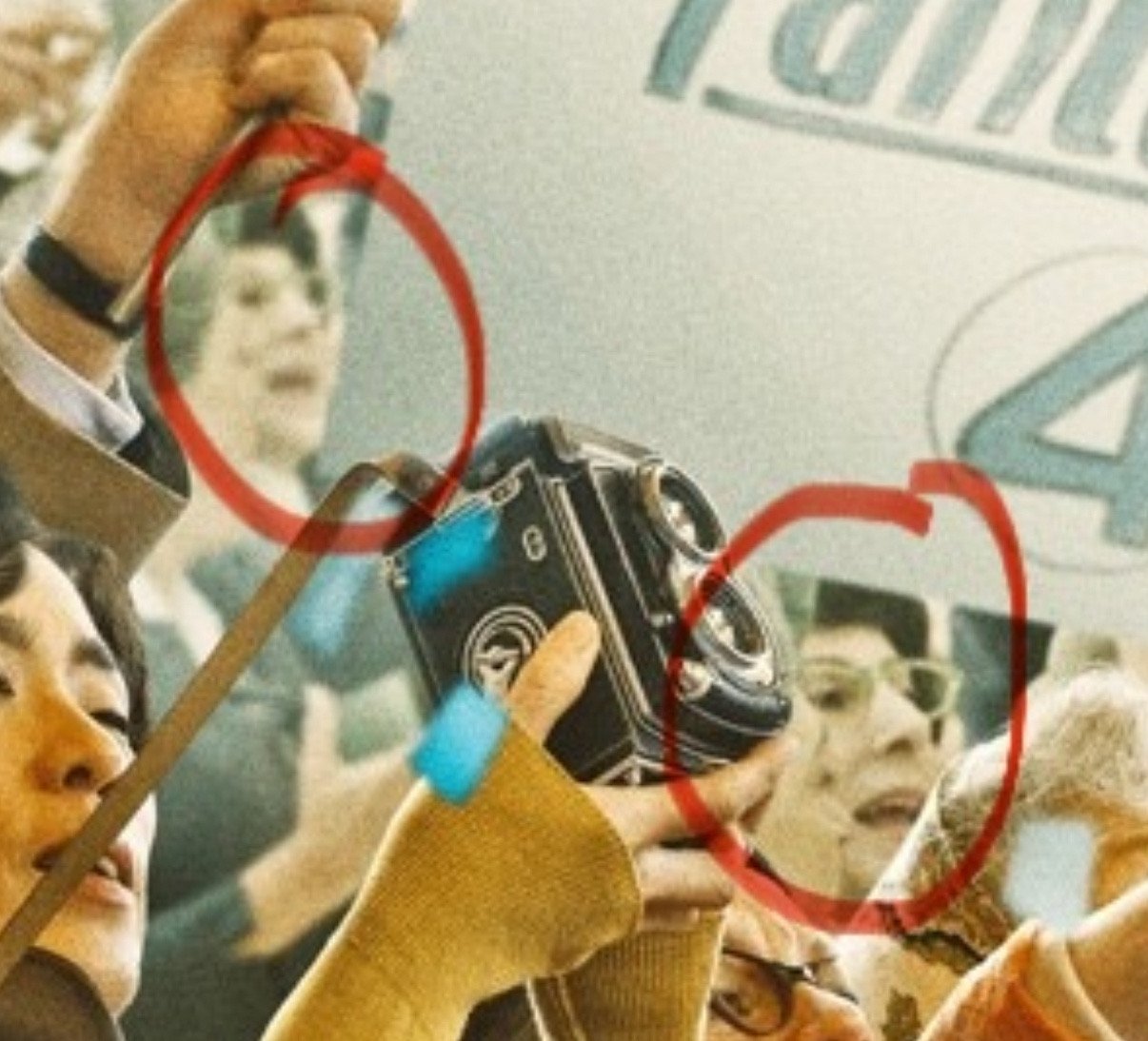
#6 is a rangefinder camera. The viewport is on the right side. He’s looking through it like old people who wear glasses would.
The only valid criticism here is the three fingers thing. The rest are just dumb. There are much more plausible reasons for those things than “OMG A.I.!”
The hand between 5 and 8 wouldn’t be holding a flag at that angle
3 is wrong, you can clearly see where one side of the coat ends.
“It isn’t AI, our marketing team is just incompetent!”
The three fingers and a thumb is obviously an homage to The Thing.
/s
The only really damning ones i see are the duplicate face and the three fingers, and i actually think both are not signs of AI. With the 3 fingers, it looks like his index finger might be perched on the other side of the flagpole out of view, like some people hold a pencil. With the duplicate face, that seems much more like a human error. A graphic artist filling in the background got lazy. The whole thing does have a kind of fultered overproduced look that reminds me of some AI stuff, but I don’t see anything conclusive, and a lot of the examples pointed out below are definitely baseless.
Beyond the weird AI quirks, there is a lot with the overall composition that competent artist or designer wouldn’t do. Random blurs on things in motion with no apparent purpose and just distract. The perspective of the crowd is just weirdly stacked like filler. Using atmospheric perspective improperly. This is like a soup of artist tricks applied improperly.
Everything appears to be chaos with no logical order or intent to guide the viewer. The overall hierarchy of key elements is way off, there is no hint where or what to look at. The title is almost lost in the mess.
Anyhow just appears like something AI would do or a very untrained designer who doesn’t understand visual communication well.
Looks like they would have been better off snapping a photo during the filming than cobbling together this visual abomination.