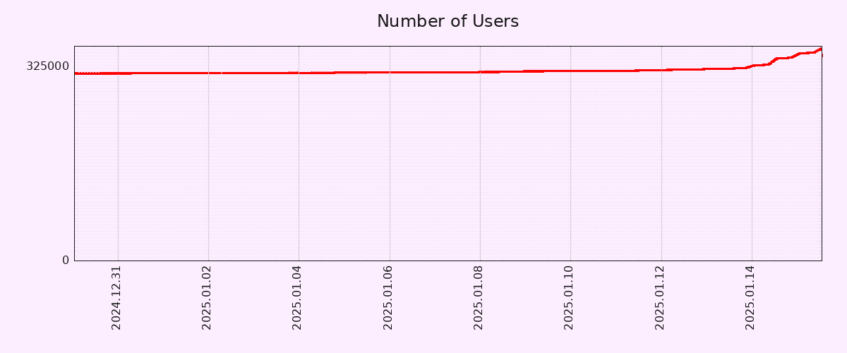
Editing to let people know that I will be blocking anyone who feels the need to tell me why this graph is inaccurate. I truly don’t care, but feel free to chime in with your useless take and land a spot on my block list! 🙂
To be fair, the Y-Axis doesn’t start from zero.
That being said, 10% account growth in 2 days is pretty solid. Let’s hope both account creation and engagement metrics (MAUs/DAUs) keep growing.
EDIT: Correct Axis type.
Pedantic: You mean Y-axis, right? Technically, neither start at zero but I think you meant Y based on context.
No, all time based graphs should start at the big bang.
I actually wish this were true. Sure, they would show the snippet for the time we care about, but they MUST provide the source graph that contains all data back to the Big Bang. Specifically the Plank Era, we don’t want a graph where time doesn’t exist, that would make the graph useless.
Sign me up for your newsletter
Yes, of course the Y axis.
I work with charts/vizualizations/data a lot, but for whatever reason I reflexively mistake X/Y a lot. It’s not even funny.
I make the same mistake all the time for some reason, though I know which is which. I have a theory the reason is that the X axis is often used to plot years (Y), which messes with my brain ever so slightly.
That said, I don’t think the Y axis should necessarily start in zero in a graph that seeks to show the pattern of growth rather than the number of users in absolute terms. If anything, a longer X axis would have been more useful, in order to show how unusual such a growth pattern is.
Y has a vertical part, just like its axis. X is the other one.
This is like a weird personal thing that I can’t even explain. For whatever reason, the Y axis becomes labelled as X in my mind in random situations. And I use charts (and other data visualizations a lot).
The funny thing is when I am thinking of X, I don’t have this urge to call it Y. If I am looking at horizontal, X is the first thing that comes to mind. But not with Y.
Isn’t that a 1‰ growth or am I mathing wrong?
Edit: I’m wrong and that’s why I shouldn’t comment first thing in the morning. The math is mathing, I’m just not braining.
You are mathing wrong. The GP is correct, except for the fact that it applies to the Y axis.
(… it’s a much smaller change on the X axis anyway, something with 10 zeros before the first non-zero digit…)
Its ~12%
One percent of 300,000 would be 3,000.
Starting the y-axis zero wouldn’t change the shape of the curve at all, but it would make the increase seem less dramatic.
It’s a ~10% increase, but the scale makes it look like the count shot up by 10x at first glance. I know that’s why you always need to look at the axis labels, but graphs like this are purposely presented this way because they’re easy to misinterpret for the average person.
It was an error on my part.
For other nerds that absolutely hate dishonest and biased graphs, I present the normalized data. Wow. What a vertical line. 🤦♀️

Exactly my first thought seeing this graph.
its the federation effect in action. I expect pixel fed to get a slow trickle of new users as legacy social media cages and milks its current users for ads.
Despite the misleading graph from OP, the slow uptick seems to be common with federated social media because there’s little incentive to make viral posts to sell ads.
Just a FYI, Dan who made Pixelfed also does Loops and a few other Fedi projects in case people want more cool stuff to play with.
What is the general outlook on others helping him build them out? I would hate to see tons of the energy dissipate because it was one guy trying his damnedest to out compete tech companies on two fronts.
I’m not that sure on what kind of crew he may or may not have.
I wish they would put the official app on F-Droid. I use PixelDroid, but it’d still be nice to try.
the official app is much slower and less polished than PixelDroid and Pixelix.
they do have their own F-droid repo, though https://fdroid.pixelfed.net/fdroid/repo
deleted by creator
deleted by creator
I used Obtainium to get it
I signed up, though I generally don’t like following individuals and much prefer groups or communities like Lemmy. Gotta support independent social media.
I found following hastags I’m interested in to work better for me.
This also works really well for Mastodon. Gets your feed going super easily.
this is probably the intended method to use mastodon, if you’re trying to follow individual accounts you’re just gonna suffer.
I also found actually taking time to find an instance that you vibe with (in my case, jorts.horse) really helps to keep stuff interesting in your Local timeline. As a bonus, it also furthers decentralization :)
Yeah I was on Fosstodon first. Moved to Sakurajima (Sharkey) and now I’m on Sakurajima (Mastodon).
You’re right, the instance makes a big difference. Very important to find one you enjoy.
Why does the instance make a big difference? I thought the point in federation is that the instance does NOT matter because everything shows up across instances? Genuinely curious and would appreciate if someone could explain.
while your Feed won’t matter as it’s chronological and based on your followed hashtags, as @reseller_pledge609@lemmy.dbzer0.com pointed out, your chosen instance will make an impact on your local feed.
It’s kinda like how you can make an account on lemmy.ml and still connect to any* instance, but you’ll probably still have a harder time finding non-tankies.
*if they haven’t defederated, that is
Local feed makes sense. Thanks!
So, your home instance is gonna have a “vibe”. Each instance is focused on different things and has different people so the Local feed will be very different. Different instances also block different things and have different rules.
Once you start following some hashtags, it matters less. Like you said, it’s all mostly available from anywhere.
The local feed being different makes sense. I was thinking of the front page (to use Lemmy terms). Thanks for explaining.
Impressive indeed
Both sites have different monthly active users numbers, but between 42k and 52k is quite impressive
That’s a lot of mastodon users. And misskey is more popular than I thought.
This is what a good app does to a MF.
Happy to see!
I wondering what caused such jump.
Because news broke that Meta lobbied for the TikTok ban. So people are now boycotting Meta platforms like Facebook and Instagram. Since Pixelfed is an Instagram clone and recently launched the app, it has gained a ton of popularity. The timing of the app launch honestly couldn’t have been better, because it gave all of the fleeing Instagram users a nice convenient place to land.
They released an official all on the app stores
deleted by creator
I think it’s been out for a while.
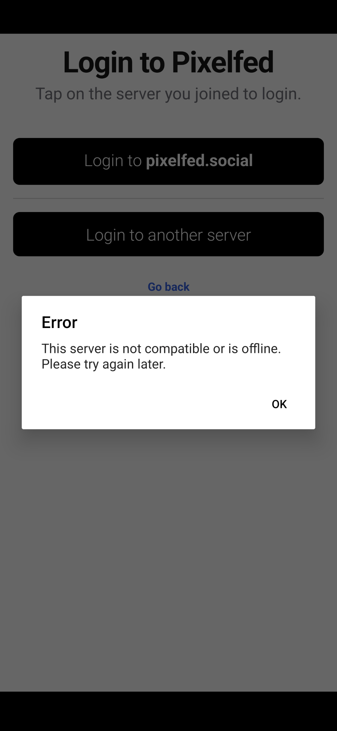
Anyways, when I try to log into the main recommended server (where I already have an account), before I even get to the login page, it gives me this error

Which is a pretty funny thing for the official app to say about the official main instance 🤣
Instead I just installed the PWA from the browser. It works ok.
I just signed up after seeing an article saying links to the website are being blocked by Instagram (IIRC). I figured it must be worth looking into if they’ve gone that far
wow, it’s really cool. I have also made an account on gram.social (pixelfed server). so far I am liking it :)
I’m not sure the graph is accurate.
What are you supposed to put in the “server url” field in Pixelix? I put the instance I have an account on, because I don’t have any other information that would make sense to put there, but nothing happens when I tap the arrow.
Also, what the fuck, fediverse. It’s exactly this kind of bullshit that’s why nobody joins you. Fix it for Christ’s sake. Something this unintuitive doesn’t even belong in a beta build. If I was a paid instagram plant making this app to frustrate people into going back to instagram, this is the splash screen I’d use. Stop making it impossible to recommend you in good faith to people I like.
I don’t know about that app specifically, but I know some fediverse apps do not have all instances in their directory. For example, fedilab doesn’t have friendica.world. I would suggest hunting around for an app that supports your instance, but I agree, it is a dumb problem. What is the point of being able to join whatever instance you want if it is not listed on the app?
I tried self hosting Pixelfed but gave up because it wouldn’t work. I’m used to Docker containers that are able to just start up by themselves, but the guide didn’t work for me. Maybe it’s time to try again.
Oh no, Metas profits!! How will they live in a slightly better world now?
By blocking all mention of Pixelfed on their platforms.
Wow, how pathetic.
I can’t say with a straight face that I didn’t see this coming.
Oh, that self-perpetuating evil machine seems to check out, yeah.
… oh
deleted by creator
Yes, it’s the most confusing part, if you want to discover Pixelfed accounts from other servers, you have to go to another server’s home page, then click on “Explore” which will show you popular posts by that server’s users. I have done this and now I follow a bunch of accounts from other servers, but the process is very convoluted and the average user would not bother I guess.
The web version of Pixelfed does have a “Global Feed” page but that’s 99% Mastodon posts because the “Global Feed” is actually global relative to the whole Fediverse.
deleted by creator
Yeah, fediverse platforms aren’t going to seriously compete against the big corporate ones until the user experience is as simple.
Exactly. I agree. It needs to be simplified. As easy as creating an account.
Lemmy is unique on the fediverse, in that it has communities that you can subscribe to. The closest equivalent is community groups on Friendica. Pixelfed is more similar to Mastodon in that you can follow individual accounts, or hashtags/search terms, which is how you subscribe to different content in your feed. For example, I follow #catsofmastodon and see all posts tagged with that in my feed. Hashtagging your posts is very important if you want it to be seen. Lemmy is more oriented towards discussions, which is why communities make more sense in this context than on Pixelfed or Mastodon.
Gotta have an official app, that’s the only reason I made an account and posted anything.
Pretty sure the official app has been in testing for a while. And I feel like I heard recently it’s releasing a stable build.
In case I’m wrong though, there’s always PixelDroid and the recently released Pixelix.
Also, like most fediverse apps, the first-party, official apps are always very basic and more of a proof-of-concept kind of thing. In most cases you’d be better served with third-party apps.
The official app had been available for everyone in beta for months, and it came out of beta just a few days ago.
Maybe try looking stuff up before stating dumb shit.
Beta doesn’t mean publicly ready. I knew about it and didn’t use it on purpose. Obviously the data shows I wasn’t the only one.
Maybe try critically thinking before stating dumb shit.


